Tuesday, June 28, 2016

Revisiting Some Paintings

As I prepare for several shows that are scheduled for later this year,
I'm pulling out old paintings that are not ready for public viewing. 
Some of the paintings are incomplete, temporarily abandoned when I either hit the wall of frustration or allowed myself to be sidetracked by a newer inspiration.
And then there are the paintings that I had previously considered complete but now realize
that I could have/should have done a better job.

This painting, from a couple of years ago, falls into the latter catagory.   
A photograph in my pile of "Images for Art" provided the inspiration as did the movie 'Take Shelter', which features some dramatic, stormy skies.
If you haven't seen that movie, starring Michael Shannon, I highly recommend it.

I took some liberties with the image
and felt happy with my painting.

But....
a couple of years has made a difference with my perspective and presumably with my level of skill.
Looking at the old painting,
I now think that the sky is pretty dreadful.
The only thing that I do like is the thin band of light blue at the horizon,
otherwise.....
bleh!
And speaking of the horizon...
I now don't like how it is located almost at the center of the painting.
Moving the horizon up or down would almost certainly introduce a more satisfying dynamic to the image.

Also, the dark, stormy atmosphere wasn't working for me anymore.
With an abundance of conflict swirling around in daily news,
I decided I wanted this painting to take on a new personality.

I keep my camera in my car in case I see a sky that I want to remember and have quite a few images of clouds on file.
This particular cloud cluster over the football field of our community high school....
seemed like a good candidate to inform and guide me as I revised the stormy sky.

The horizon was dropped a bit.
The tire tracks shifted slightly.

The sky and the field brightened,
and the clouds became friendlier.
A little more work is needed,
but I'm feeling better about allowing this painting to be viewed by the public.

Also reworked...
this painting from a workshop a few years ago.
I abandoned it when I got frustrated with the shadows.
 As I recently looked at it with a more knowing eye,
I realized that I had created a scene where the sun was shining from both the left side and right side of the painting.
No wonder I was confused!

Thankfully,
I am now wiserer.
The shadows now make sense,
and I now like this a bit more....
maybe enough to allow public viewing.

Saturday, June 18, 2016

Rookie Mistake

A few weeks ago, I came up with a new necklace design.
This is not one of those designs that began with a clear vision;
 it evolved as I went along.
I cut out a large circle from a sheet of 24 gauge brass and textured the surface with one of my old, flea market chisels.
Sitting on my workbench were parts that I had made for portal charms, intending to use them for more bracelets.
Bringing a portal charm and the large brass disc together seemed like a good idea.
After doming the brass disc and soldering a bail on the back, 
the portal charm was riveted in place with segments of sterling wire.

I had an appointment to deliver new inventory to Woodmere Art Museum in Philadelphia 
and planned to bring the necklace.
It seemed like a good idea to have some companion pieces for the necklace,
but that meant I had to work fast to develop that idea and then make something.

Bracelets!

I cut out smaller brass discs, 
textured them with the same chisel, 
domed them and soldered sterling bezels in the center.
The bangle portion was cut from 14 gauge brass wire and shaped on my circular bracelet mandrel.
What a rookie mistake!
Once the wire bangles were shaped and work hardened,
I soldered them to the formed discs.
Cabochons were set in the bezels
and the metal was cleaned.
I was so pleased that I finished the bracelets in time for my appointment
but then realized what an error I had made in using the circular mandrel.
The weight of the disc makes the bracelet slip down,
completely hiding the featured texture and bezeled cabochon.

I should have used my oval bracelet mandrel,
creating a form that would have sit comfortably on the wrist without freely slipping around.
These lovely looking bracelets are still on my workbench,
waiting for me to revise the design to make them functional and marketable.

My other rookie mistake of the week...
leaving a mixed metal piece in the pickle pot for a few too many days.
Whoops....
I forgot it was there.

The word of the week...
doh!

Sunday, June 12, 2016

Blocking, and Reblocking, a New Painting

I blocked out the beginning of a new painting a few nights ago
and thought,
"All right... 
this could possibly be the beginning of something worthwhile."
And then I really looked at it.

I was using a photograph for inspiration,
and realized that I had diverged from the image in some significant ways.
Diverging is not inherently a bad thing,
because, 
after all, 
a painting is not a photograph.

But... 
diverging can be a bad thing 
if the changes are not making an improvement.
My first session had everything a bit too high on the canvas
with the net effect of minimizing the sky...
not a good thing.
The expansiveness of the sky 
is one of the things that I find compelling about this photo.

I went to my easel last night to reblock the image.

Since I was primarily interested in getting the elements more properly situated,
I put only three colors of paint on my palette.
That limited palette was also a factor of my frugality.
The layout still needs quite a bit of finessing,
but I think that this updated version 
better captures the essence of the photograph.

More work, 
with more paint selections, 
later tonight.

Tuesday, June 7, 2016

Happy Clients Are a Gift

After being the selected landscape architect for a project in northern Pennsylvania over 20 years ago, I never had to promote my business.
The initial clients continued to hire me for a series of projects in Pennsylvania as well as New Jersey, New York and Nevada.
One happy client can often be the most effective path to more work and hopefully,
more happy clients.

Because of that first Pennsylvania project,
I was hired to develop a Master Plan for a community park in northern New Jersey.
The local Garden Club funded the Master Plan, so I ended up coordinating with the club's President which led to a nice friendship. 
The President and her husband eventually left New Jersey, relocating to a plateau on the edge of Rapid City, South Dakota.
During a post-move phone conversation, President mentioned that their new home needed a completely revamped landscape but she had yet to find anyone in Rapid City to develop a design.
That's when I said,
"You know....there are airplanes that can solve problems like that."
And....
I was hired.

Rapid City presented a landscape significantly different from any that I had previously worked with.
The soil on the plateau is very acidic and very dry.
The winters can be bitterly cold and the summers, staggeringly hot and dry.
The winds are powerful and the threat of a wildfire constantly hovers.
I visited nurseries to understand the local plant palette and noted which trees, shrubs and perennials were thriving in nearby landscapes.
Being one who likes to do work that's compatible with the vernacular landscape,
local stone was selected for the paving and wall surfaces.

The existing entry drive as well as all other parts of the landscape appeared to have been laid out as a simple reaction to getting from one point to another with no intention of purposeful lingering.

That needed to change.

A new walkway and entry patio was designed to make the arrival more gracious and welcoming. 
The front side of the house has a view to Mount Rushmore, 
and I wanted family and guests to have a comfortable gathering place where that view could be appreciated, 
especially in the evening when the other Presidents are washed in glowing light.
Aside from a few small trees, 
the landscape on the back side of the house was pretty barren.
The space between the house and the garage served no purpose.

Selecting the best location for a pool, 
I thought that the back side of the garage would provide an effective anchor
but the location was definitely more about the extended views.

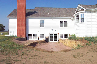
A new doorway to the house was added 
for direct access to the newly rennovated lower level,
requiring significant excavation,
retaining walls
and some careful drainage planning.

Paths and steps were built
to comfortably navigate the different elevations.

The pool,
with an accompanying trellis structure for a bit of shade,
became a refreshing retreat for those hot, dry summer days.

That underutilized space between the house and garage
became a comfortable outdoor dining area,
complete with grill and a built in buffet surface
as well as welcomed protection from the unrelenting wind.

I recently found out that President and her husband sold the property 
to live full time on the west coast.

How fortunate for me that a project in northern Pennsylvania
eventually led me to a plateau in South Dakota.

Happy clients are a gift.